---
title: Modal
description: Learn more about the Modal action set in App Bridge.
api_name: app-bridge
source_url:
html: 'https://shopify.dev/docs/api/app-bridge/previous-versions/actions/modal'
md: 'https://shopify.dev/docs/api/app-bridge/previous-versions/actions/modal.md'
---
# Modal
**Note:**
This is a legacy API. Use the latest version of [`Modal`](https://shopify.dev/docs/api/app-home/polaris-web-components/modal) instead.
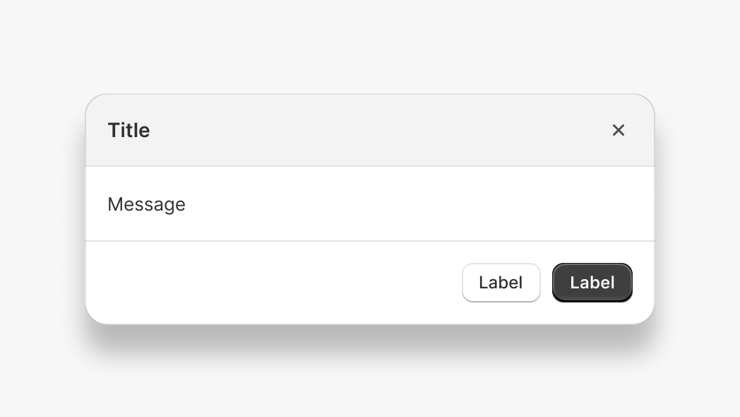
Modals are overlays that prevent users from interacting with the rest of the app until they take an action that dismisses the modal.
Modals can be disruptive because they require users to take an action before they can continue interacting with the rest of Shopify. You should use modals sparingly.
The `Modal` action set allows you to open two types of modal: message and iframe. Message modals support only plain text content. Iframe modals allow you to fully customize the modal contents.
There are 2 ways to use the modal action:
1. [Plain JavaScript](#plain-javascript)
2. [React component](#react)
***
## Plain JavaScript
### Example code
Import the `createApp` function from `@shopify/app-bridge` and the `Modal` from `@shopify/app-bridge/actions`. Then use the `createApp` function to create an app.
**Note:**
In the following example, `config` is a valid App Bridge configuration object. Learn more about [configuring App Bridge](https://shopify.dev/docs/api/app-bridge/previous-versions/app-bridge-from-npm/app-setup#initialize-shopify-app-bridge-in-your-app).
```js
import createApp from '@shopify/app-bridge';
import {Modal} from '@shopify/app-bridge/actions';
const app = createApp(config);
```
### Create a message modal
Create a message modal using the `message` option. Message modals support plain text content of any length.
```js
const modalOptions = {
title: 'My Modal',
message: 'Hello world!',
};
const myModal = Modal.create(app, modalOptions);
```
### Create an iframe modal
Create an iframe modal by passing the `url` option. If the `url` option is present, then the `message` option will be ignored.
### Create an iframe modal with an absolute URL
```js
const modalOptions = {
title: 'My Modal',
url: 'http://example.com',
};
const myModal = Modal.create(app, modalOptions);
```
**Note:**
The absolute url option allows you to specify a sub domain, but not a different domain from the app url.
### Create an iframe modal with a relative path
A relative path iframe sets the URL relative to your app root.
```js
const modalOptions = {
title: 'My Modal',
path: '/settings',
};
const myModal = Modal.create(app, modalOptions);
```
If your app’s root URL was `https://myapp.com`, then the example above would open a modal at `https://myapp.com/settings`.
### Open and close a modal
Open and close the modal by dispatching the `OPEN` and `CLOSE` actions.
```js
const modalOptions = {
title: 'My Modal',
url: 'http://example.com',
};
const myModal = Modal.create(app, modalOptions);
myModal.dispatch(Modal.Action.OPEN);
// Close modal
myModal.dispatch(Modal.Action.CLOSE);
```
### Add footer buttons
Add buttons to the modal footer. All modals support one primary button and multiple secondary buttons. To learn more about buttons, refer to [Button](https://shopify.dev/docs/api/app-bridge/previous-versions/actions/button).
```js
const okButton = Button.create(app, {label: 'Ok'});
okButton.subscribe(Button.Action.CLICK, () => {
// Do something with the click action
});
const cancelButton = Button.create(app, {label: 'Cancel'});
cancelButton.subscribe(Button.Action.CLICK, () => {
// Do something with the click action
});
const modalOptions = {
title: 'My Modal',
message: 'Hello world!',
footer: {
buttons: {
primary: okButton,
secondary: [cancelButton],
},
},
};
const myModal = Modal.create(app, modalOptions);
```
### Subscriptions
Subscribe to modal actions by calling `subscribe`. This returns a function that you can call to unsubscribe from the action.
```js
const modalOptions = {
title: 'My Modal',
url: 'http://example.com',
};
const myModal = Modal.create(app, modalOptions);
const openUnsubscribe = myModal.subscribe(Modal.Action.OPEN, () => {
// Do something with the open event
});
const closeUnsubscribe = myModal.subscribe(Modal.Action.CLOSE, () => {
// Do something with the close event
});
// Unsubscribe to actions
openUnsubscribe();
closeUnsubscribe();
```
All [action sets](https://shopify.dev/docs/api/app-bridge/previous-versions/actions#action-sets) in App Bridge support the same subscribe API. The modal footer buttons also return an unsubscribe function.
```js
const okButton = Button.create(app, {label: 'Ok'});
const okButtonUnsubscribe = okButton.subscribe(Button.Action.CLICK, () => {
// Do something with the click action
});
okButtonUnsubscribe();
```
### Unsubscribe from all
Call `unsubscribe` to remove all subscriptions on the modal and its children (including buttons).
```js
const okButton = Button.create(app, {label: 'Ok'});
okButton.subscribe(Button.Action.CLICK, () => {
// Do something with the click action
});
const cancelButton = Button.create(app, {label: 'Cancel'});
cancelButton.subscribe(Button.Action.CLICK, () => {
// Do something with the click action
});
const modalOptions = {
title: 'My Modal',
url: 'http://example.com',
footer: {
buttons: {
primary: okButton,
secondary: [cancelButton],
},
},
};
const myModal = Modal.create(app, modalOptions);
myModal.subscribe(Modal.Action.OPEN, () => {
// Do something with the open event
});
myModal.subscribe(Modal.Action.CLOSE, () => {
// Do something with the close event
});
// Unsubscribe from modal open and close actions
// Unsubscribe from okButton and cancelButton click actions
myModal.unsubscribe();
```
### Unsubscribe from only modal actions
Call `unsubscribe` with `false` to remove only modal subscriptions while leaving child subscriptions intact. For example, you might want to unsubscribe from the modal but keep button listeners so that you can reuse the buttons in a different modal.
```js
const okButton = Button.create(app, {label: 'Ok'});
okButton.subscribe(Button.Action.CLICK, () => {
// Do something with the click action
});
const cancelButton = Button.create(app, {label: 'Cancel'});
cancelButton.subscribe(Button.Action.CLICK, () => {
// Do something with the click action
});
const modalOptions = {
title: 'My Modal',
message: 'Hello world!',
footer: {
buttons: {
primary: okButton,
secondary: [cancelButton],
},
},
};
const myModal = Modal.create(app, modalOptions);
// Unsubscribe from only modal open and close actions
myModal.unsubscribe(false);
// You can reuse the buttons above in a new modal
// Their subscriptions will be left intact
const newModalOptions = {
title: 'Confirm',
message: 'Are you sure?',
footer: {
buttons: {
primary: okButton,
secondary: [cancelButton],
},
},
};
const confirmModal = Modal.create(app, newModalOptions);
```
### Update options
Call the `set` method with partial modal options to update the options of an existing modal. This automatically triggers the `UPDATE` action on the modal and merges the given options with the existing options.
```js
const modalOptions = {
title: 'My Modal',
url: 'http://example.com',
};
const myModal = Modal.create(app, modalOptions);
myModal.set({title: 'My new title'});
```
### Update footer buttons
Update buttons attached to a modal's footer. Any updates made to the modal's footer buttons automatically trigger an `UPDATE` action on the modal.
```js
const okButton = Button.create(app, {label: 'Ok'});
const cancelButton = Button.create(app, {label: 'Cancel'});
const modalOptions = {
title: 'My Modal',
message: 'Hello world!',
footer: {
buttons: {
primary: okButton,
secondary: [cancelButton],
},
},
};
const myModal = Modal.create(app, modalOptions);
myModal.dispatch(Modal.Action.OPEN);
okButton.set({label: 'Good to go!'});
```
### Set modal size
By default, modals have a fixed size of `Small`. You can customize the size of a modal by passing in a different `Modal.Size` value.
```js
const modalOptions = {
title: 'My Modal',
message: 'Hello world!',
size: Modal.Size.Large,
};
const myModal = Modal.create(app, modalOptions);
myModal.dispatch(Modal.Action.OPEN);
```
The 3 values for `Modal.Size` are `Small`, `Medium` and `Large`.
**Note:**
The full screen modal size has been deprecated in version 1.6.5. If you open a modal with the size set to `Full`, then it will display in the default size of `Medium`.
The `Auto` modal size has been deprecated in version 1.12.x and moved into the `setupModalAutoSizing` utility. If you open a modal with the size set to `Auto`, then it will default to size `Medium`.
### Set modal size automatically
The `setupModalAutoSizing` utility allows your iframe modal to update its height to fit the page content.
In your main app, open an iframe modal:
```js
import createApp from '@shopify/app-bridge';
import {Modal} from '@shopify/app-bridge/actions';
import {setupModalAutoSizing} from '@shopify/app-bridge/utilities';
const app = createApp({
apiKey: '12345',
});
const modalOptions = {
title: 'My Modal',
path: '/modal',
};
const myModal = Modal.create(app, modalOptions);
myModal.dispatch(Modal.Action.OPEN);
```
Inside the modal page, import the `setupModalAutoSizing` utility to enable auto sizing:
```js
import createApp from '@shopify/app-bridge';
import {setupModalAutoSizing} from '@shopify/app-bridge/utilities';
const app = createApp({
apiKey: '12345',
});
setupModalAutoSizing(app);
```
Avoid setting `height`, `margin` or `padding` styles on the `` element of your modal page, as these will interfere with automatic modal sizing. As a workaround, set these styles on a wrapper element instead.
If you are using Shopify Polaris React, be aware that it applies `height: 100%` to the `` element by default. You will need to override this style on your modal page.
**Note:**
The automatic modal sizing utility works with all size options.
### Communicate with the parent page
**Note:**
Available in App Bridge version **1.25.0** and above.
It’s often useful for a modal to be able to communicate with its parent page. You can use the `DATA` action to send messages between an iframe modal and its parent app.
**Note:**
App Bridge serializes data using `JSON.stringify`. Objects and arrays can be serialized, but object references (for example, DOM elements) will be lost.
To send data from a modal, dispatch a `Modal.Action.DATA` action from your modal:
```js
import createApp from '@shopify/app-bridge';
import {Modal} from '@shopify/app-bridge/actions';
const app = createApp({
apiKey: '12345',
});
const payload = {
message: 'Hi this is modal!'
};
app.dispatch(Modal.data(payload));
```
In your app, subscribe to `Modal.Action.DATA`:
```js
import createApp from '@shopify/app-bridge';
import {Modal} from '@shopify/app-bridge/actions';
const app = createApp({
apiKey: '12345',
});
app.subscribe(Modal.Action.DATA, (action) => {
console.log('Received message from modal:', action);
});
```
To send data from the app to the modal, complete the steps in reverse: subscribe to `Modal.Action.DATA` in the modal and dispatch a `Modal.Action.DATA` action from your app.
***
## React
### Example code
Import the `Modal` component from `@shopify/app-bridge-react`.
**Note:**
In the following example, `config` is a valid App Bridge configuration object. Learn more about [configuring App Bridge](https://shopify.dev/docs/api/app-bridge/previous-versions/app-bridge-from-npm/app-setup#initialize-shopify-app-bridge-in-your-app).
**Note:**
When using the App Bridge React library, you need to wrap all of your App Bridge React code inside of a single App Bridge [`Provider`](https://shopify.dev/docs/api/app-bridge/previous-versions/app-bridge-from-npm/using-react#provider).
```jsx
import React from 'react';
import ReactDOM from 'react-dom';
import {Provider, Modal} from '@shopify/app-bridge-react';
function MyApp() {
return (
);
}
const root = document.createElement('div');
document.body.appendChild(root);
ReactDOM.createRoot(root).render();
```
### Props
| Name | Type | Description | Required |
| - | - | - | - |
| open | `boolean` | Whether the modal is open or not | Yes |
| src | `string` | The url that will be loaded as the content of the modal | |
| title | `string` | The content for the title of the modal | |
| size | `"Small"`, `"Medium"`, `"Large"` | Controls the size of the modal | |
| message | `string` | The message to display inside the modal. If a `src` prop is specified, this prop will be ignored. | Yes |
| primaryAction | `ActionProps` | Primary action | |
| secondaryActions | `ActionProps[]` | Collection of secondary actions | |
| onClose | `() => void` | Callback when the modal is closed | |
**Note:**
The `Auto` modal size has been deprecated in version 1.12.x. If you open a modal with the size set to `Auto` it will default to size `Medium`.
#### ActionProps
| Name | Type | Description | Required |
| - | - | - | - |
| content | `string` | Content the action displays | |
| destructive | `boolean` | Should the action be styled as destructive | |
| disabled | `boolean` | Should the action be disabled | |
| external | `boolean` | Forces url to open in a new tab | |
| target | `"ADMIN_PATH"`, `"REMOTE"`, `"APP"` | Where to display the target link | |
| url | `string` | A destination to link to | |
| onAction | `() => void` | Callback when an action takes place | |
***