Inline
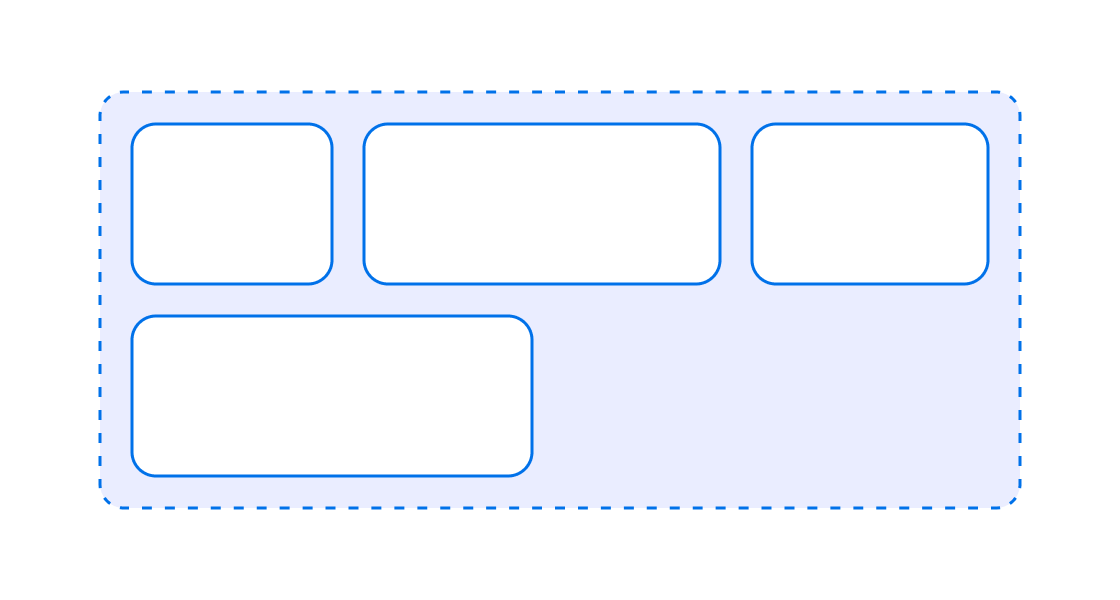
Use this to organize layout elements along the horizontal axis of the page. It's great for horizontal alignment.
Anchor to inlinestackpropsInlineStackProps
- Anchor to inlineAlignmentinlineAlignmentMainAxisAlignmentDefault: 'start'
Position children along the main axis
- Anchor to blockAlignmentblockAlignmentCrossAxisAlignmentDefault: 'start'
Position children along the cross axis
- Anchor to accessibilityRoleaccessibilityRoleAccessibilityRoleDefault: 'generic'
Sets the semantic meaning of the component’s content. When set, the role will be used by assistive technologies to help users navigate the page.
- Anchor to accessibilityLabelaccessibilityLabelstring
A label that describes the purpose or contents of the element. When set, it will be announced to users using assistive technologies and will provide them with more context. When set, any children or
labelsupplied will not be announced to screen readers.- MaybeTwoBoxEdgesShorthandProperty<SpacingKeyword | boolean>
Adjust spacing between children
- Anchor to blockGapblockGapboolean | SpacingKeyword
Adjust spacing between elements in the block axis.
Alias for
- Anchor to inlineGapinlineGapboolean | SpacingKeyword
Adjust spacing between elements in the inline axis.
Alias for
- Anchor to rowGaprowGapboolean | SpacingKeyword
Adjust spacing between children in the block axis
- Anchor to columnGapcolumnGapboolean | SpacingKeyword
Adjust spacing between children in the inline axis
- string
A unique identifier for the element.
- Anchor to blockSizeblockSizenumber | `${number}%`
Adjust the block size.
number: size in pixels.`${number}%`: size in percentages of the available space.
- Anchor to minBlockSizeminBlockSizenumber | `${number}%`
Adjust the minimum block size.
number: size in pixels.`${number}%`: size in percentages of the available space.
- Anchor to maxBlockSizemaxBlockSizenumber | `${number}%`
Adjust the maximum block size.
number: size in pixels.`${number}%`: size in percentages of the available space.
- Anchor to inlineSizeinlineSizenumber | `${number}%`
Adjust the inline size.
number: size in pixels.`${number}%`: size in percentages of the available space.
- Anchor to minInlineSizeminInlineSizenumber | `${number}%`
Adjust the minimum inline size.
number: size in pixels.`${number}%`: size in percentages of the available space.
- Anchor to maxInlineSizemaxInlineSizenumber | `${number}%`
Adjust the maximum inline size.
number: size in pixels.`${number}%`: size in percentages of the available space.
- Anchor to paddingpaddingMaybeAllBoxEdgesShorthandProperty<SpacingKeyword | boolean>
Adjust the padding.
To shorten the code, it is possible to specify all the padding for all edges of the box in one property.
basemeans block-start, inline-end, block-end and inline-start paddings arebase.base nonemeans block-start and block-end paddings arebase, inline-start and inline-end paddings arenone.base none largemeans block-start padding isbase, inline-end padding isnone, block-end padding islargeand inline-start padding isnone.base none large smallmeans block-start padding isbase, inline-end padding isnone, block-end padding islargeand inline-start padding issmall.trueapplies a default padding that is appropriate for the component.
Learn more about the 1-to-4-value syntax at https://developer.mozilla.org/en-US/docs/Web/CSS/Shorthand_properties#edges_of_a_box
- Anchor to paddingBlockpaddingBlockMaybeTwoBoxEdgesShorthandProperty<SpacingKeyword | boolean>
Adjust the block-padding.
base nonemeans block-start padding isbase, block-end padding isnone.
- Anchor to paddingBlockStartpaddingBlockStartboolean | SpacingKeyword
Adjust the block-start padding.
- Anchor to paddingBlockEndpaddingBlockEndboolean | SpacingKeyword
Adjust the block-end padding.
- Anchor to paddingInlinepaddingInlineMaybeTwoBoxEdgesShorthandProperty<SpacingKeyword | boolean>
Adjust the inline padding.
base nonemeans inline-start padding isbase, inline-end padding isnone.
- Anchor to paddingInlineStartpaddingInlineStartboolean | SpacingKeyword
Adjust the inline-start padding.
- Anchor to paddingInlineEndpaddingInlineEndboolean | SpacingKeyword
Adjust the inline-end padding.
InlineStackProps
- inlineAlignment
Position children along the main axis
MainAxisAlignment - blockAlignment
Position children along the cross axis
CrossAxisAlignment - accessibilityRole
Sets the semantic meaning of the component’s content. When set, the role will be used by assistive technologies to help users navigate the page.
AccessibilityRole - accessibilityLabel
A label that describes the purpose or contents of the element. When set, it will be announced to users using assistive technologies and will provide them with more context. When set, any children or `label` supplied will not be announced to screen readers.
string - gap
Adjust spacing between children
MaybeTwoBoxEdgesShorthandProperty<SpacingKeyword | boolean> - blockGap
Adjust spacing between elements in the block axis. Alias for `rowGap`
boolean | SpacingKeyword - inlineGap
Adjust spacing between elements in the inline axis. Alias for `columnGap`
boolean | SpacingKeyword - rowGap
Adjust spacing between children in the block axis
boolean | SpacingKeyword - columnGap
Adjust spacing between children in the inline axis
boolean | SpacingKeyword - id
A unique identifier for the element.
string - blockSize
Adjust the block size. - `number`: size in pixels. - `` `${number}%` ``: size in percentages of the available space.
number | `${number}%` - minBlockSize
Adjust the minimum block size. - `number`: size in pixels. - `` `${number}%` ``: size in percentages of the available space.
number | `${number}%` - maxBlockSize
Adjust the maximum block size. - `number`: size in pixels. - `` `${number}%` ``: size in percentages of the available space.
number | `${number}%` - inlineSize
Adjust the inline size. - `number`: size in pixels. - `` `${number}%` ``: size in percentages of the available space.
number | `${number}%` - minInlineSize
Adjust the minimum inline size. - `number`: size in pixels. - `` `${number}%` ``: size in percentages of the available space.
number | `${number}%` - maxInlineSize
Adjust the maximum inline size. - `number`: size in pixels. - `` `${number}%` ``: size in percentages of the available space.
number | `${number}%` - padding
Adjust the padding. To shorten the code, it is possible to specify all the padding for all edges of the box in one property. - `base` means block-start, inline-end, block-end and inline-start paddings are `base`. - `base none` means block-start and block-end paddings are `base`, inline-start and inline-end paddings are `none`. - `base none large` means block-start padding is `base`, inline-end padding is `none`, block-end padding is `large` and inline-start padding is `none`. - `base none large small` means block-start padding is `base`, inline-end padding is `none`, block-end padding is `large` and inline-start padding is `small`. - `true` applies a default padding that is appropriate for the component. Learn more about the 1-to-4-value syntax at https://developer.mozilla.org/en-US/docs/Web/CSS/Shorthand_properties#edges_of_a_box
MaybeAllBoxEdgesShorthandProperty<SpacingKeyword | boolean> - paddingBlock
Adjust the block-padding. - `base none` means block-start padding is `base`, block-end padding is `none`.
MaybeTwoBoxEdgesShorthandProperty<SpacingKeyword | boolean> - paddingBlockStart
Adjust the block-start padding.
boolean | SpacingKeyword - paddingBlockEnd
Adjust the block-end padding.
boolean | SpacingKeyword - paddingInline
Adjust the inline padding. - `base none` means inline-start padding is `base`, inline-end padding is `none`.
MaybeTwoBoxEdgesShorthandProperty<SpacingKeyword | boolean> - paddingInlineStart
Adjust the inline-start padding.
boolean | SpacingKeyword - paddingInlineEnd
Adjust the inline-end padding.
boolean | SpacingKeyword
export interface InlineStackProps
  extends AccessibilityRoleProps,
    AccessibilityLabelProps,
    GapProps,
    GlobalProps,
    SizingProps,
    PaddingProps {
  /**
   * Position children along the main axis
   *
   * @defaultValue 'start'
   */
  inlineAlignment?: MainAxisAlignment;

  /**
   * Position children along the cross axis
   *
   * @defaultValue 'start'
   */
  blockAlignment?: CrossAxisAlignment;
}
MainAxisAlignment
'start' | 'center' | 'end' | 'space-between' | 'space-around' | 'space-evenly'CrossAxisAlignment
'start' | 'center' | 'end' | 'baseline'AccessibilityRole
'main' | 'header' | 'footer' | 'section' | 'aside' | 'navigation' | 'ordered-list' | 'list-item' | 'list-item-separator' | 'unordered-list' | 'separator' | 'status' | 'alert' | 'generic'MaybeTwoBoxEdgesShorthandProperty
T | `${T} ${T}`SpacingKeyword
'none' | 'small' | 'base' | 'large'MaybeAllBoxEdgesShorthandProperty
T | `${T} ${T}` | `${T} ${T} ${T}` | `${T} ${T} ${T} ${T}`Laying out elements in a row
examples
Laying out elements in a row
React
import React from 'react';
import {
  render,
  InlineStack,
} from '@shopify/ui-extensions-react/admin';

render('Playground', () => <App />);

function App() {
  return (
    <InlineStack gap>
      <>Child 1</>
      <>Child 2</>
      <>Child 3</>
      <>Child 4</>
    </InlineStack>
  );
}
JS
import {extension, InlineStack} from '@shopify/ui-extensions/admin';

export default extension('Playground', (root) => {
  const inlineStack = root.createComponent(
    InlineStack,
    {
      gap: true,
    },
    [
      root.createText('Child 1'),
      root.createText('Child 2'),
      root.createText('Child 3'),
      root.createText('Child 4'),
    ],
  );

  root.appendChild(inlineStack);
});
Preview