Heading
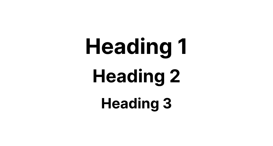
Use this to display a title. It's similar to the h1-h6 tags in HTML
Anchor to headingpropsHeadingProps
- string
A unique identifier for the field.
- Anchor to sizesize
The visual size of the heading.
There are no guarantee that the level set will render the same level in the HTML
<h*>element. The heading level that gets rendered is determined by the parentorSectioncomponent.
HeadingProps
- id
A unique identifier for the field.
string - size
The visual size of the heading. There are no guarantee that the level set will render the same level in the HTML `<h*>` element. The heading level that gets rendered is determined by the parent `HeadingGroup` or `Section` component.
Level
export interface HeadingProps {
  /** A unique identifier for the field. */
  id?: string;

  /**
   * The visual size of the heading.
   *
   * There are no guarantee that the level set will render the same level in the HTML `<h*>` element.
   * The heading level that gets rendered is determined by the parent `HeadingGroup` or `Section` component.
   */
  size?: Level;
}
Level
1 | 2 | 3 | 4 | 5 | 6Was this section helpful?
Simple Heading example
import {render, Heading} from '@shopify/ui-extensions-react/admin';

render('Playground', () => <App />);

function App() {
  return <Heading>Store name</Heading>;
}
examples
Simple Heading example
React
import {render, Heading} from '@shopify/ui-extensions-react/admin'; render('Playground', () => <App />); function App() { return <Heading>Store name</Heading>; }JS
import {extend, Heading} from '@shopify/ui-extensions/admin';

extend('Playground', (root) => {
  const heading = root.createComponent(Heading, undefined, 'Headings are cool');

  root.appendChild(heading);
});
Preview